DESIGN BRIEF
This project would see the creation of a unique, first of its kind facility oil recycling facility.
The company wanted the facility completed for their 30th anniversary and be a celebration and reflection of them as the largest recycling company of their kind in Ireland.
The core business sees the door to door collection of used cooking oil and recycling it into new cooking oil and biodiesel.
The building would become their headquarters and reflect the ethos and presence of the company within the market sector and as a global leader.
Budget was a key constraint as was the form and configuration of the building, structure was also a key driver and informed the early design decisions.
Initially the scheme was designed as a traditional block building, however due to the constraints and speed of construction as well as cost- a steel portal frame was utilised. This frame would dictate the dimensions and, to a degree, the proportions of the building, but it would allow us to maximise the budget.
A combination of open plan office spaces, reception, conference, laboratory, canteen, and ancillary accommodation would be located within the front “public face” of the building. To the rear would be the processing plant and associated tanks which would allow for the disposal, recycling, and distribution of clean oil.
The site would also have to accommodate lorries, washing facilities, processing bays as well as storage areas, drop off points and an allowance for some future expansion.

LOCATION
Located and situated in the town of Lisburn, just outside Belfast, the scheme was sighted on an enterprise site owned by Invest NI. Our client purchased a site within this zone which would allow greater ease in attaining planning permission. The use class of a recycling plant of this nature is not always a ‘good neighbour’ and therefore we wanted to make the process as painless as possible.
Speed of development was also a consideration.
Due to the robust nature of industrial zones, the type and scale of buildings tend to be rather simplistic & common place in their design, configuration, and finish.
Typically, these are large, industrial style, metal clad buildings, almost agricultural in nature.
This starting point however, allowed us the flexibility to explore alternate architectural approaches and new ways of thinking and interacting with industrial and commercial architecture of this scale.

The layout and spatial relationships within the plan were dictated by our desire for a clear spatial zoning between the served and servant spaces, clearly defining the public and private realms.
The placement of the building within the site was intended to balance accessibility and the movement of lorries and containers around the building comfortably, whilst allowing for possible further expansion.
The use of space through the development maximises floor space & the use of site area, whilst ensuring that the client brief was at all times satisfied within the parameters of the budget.
Innovations and being innovative are at the heart of what we do as architects and what we aim to achieve through our designs and our finalised projects.
In this instance there were several innovations, including but not limited to: –
- Plan form – the intention behind the spatial layout ensures that there was a clear distinction between the public and private spaces without the need for specific control mechanisms.
The staff areas reflect the flow of the workforce as we analysed how the staff moved and operated day to day within the spaces and how this could be efficiently managed to mitigate cross contamination of product and ensure all the controlled spaces related to one another. This also allowed us to deliver more efficient specification in terms of lighting, cleaning and general finish. A detailed understanding of the daily routine of staff and how they engage with their place of work allowed us to fully understand and design around the events and timings of the day, ultimately enabling us to deliver efficiency of seating, lighting and layout.
- Lines of vision played an essential role in terms of innovating an open and inclusive environment and delivering a lack of a management hierarchy in terms of the spaces.
APPEARANCE AND FINISH
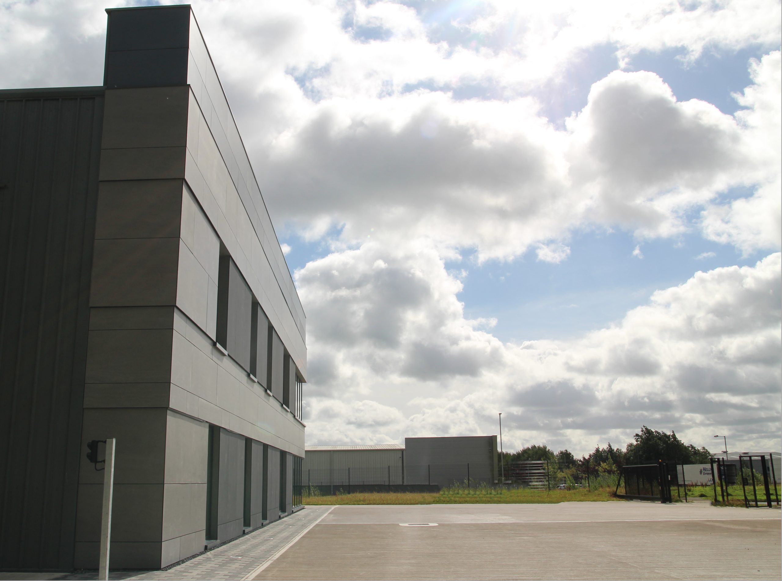
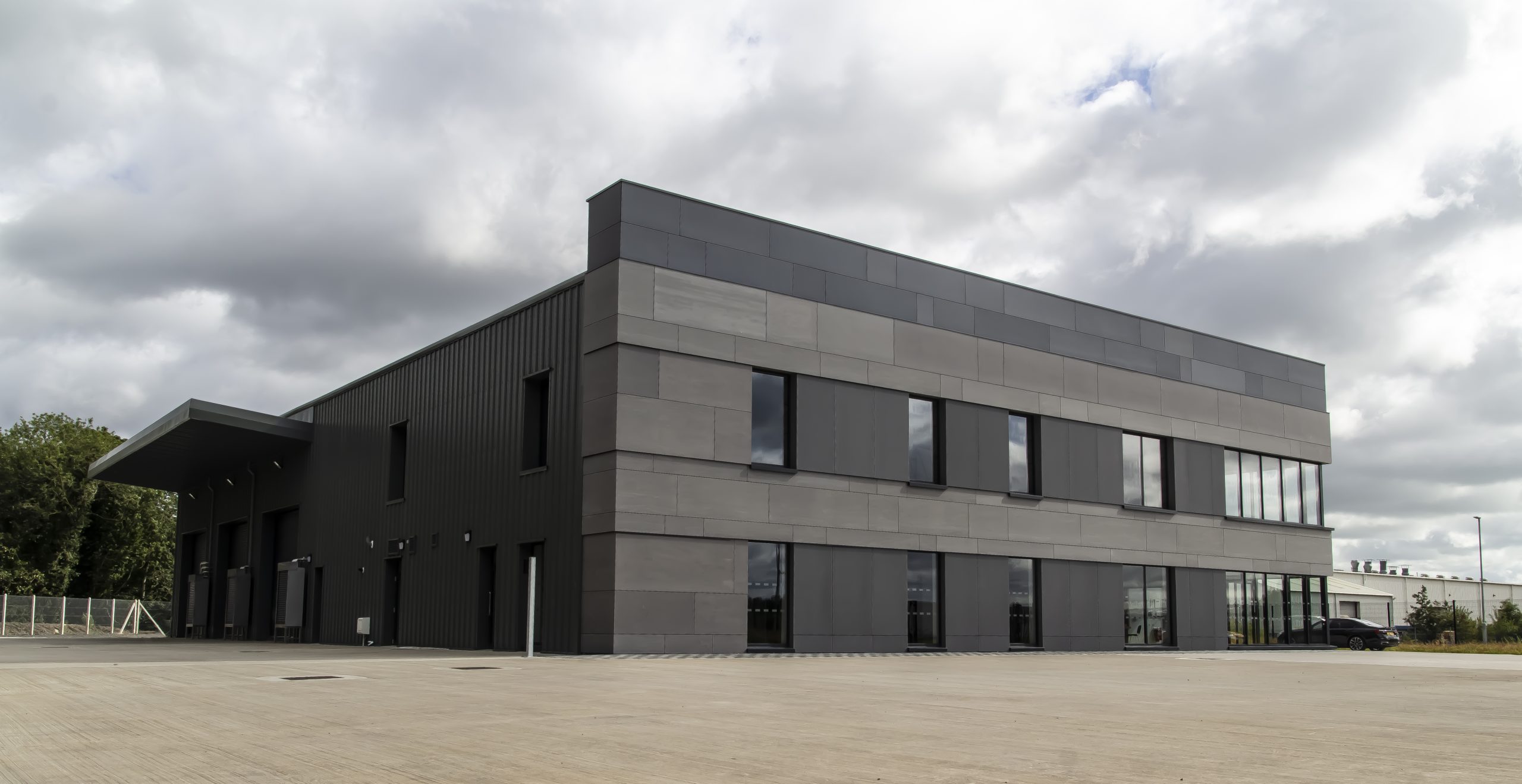
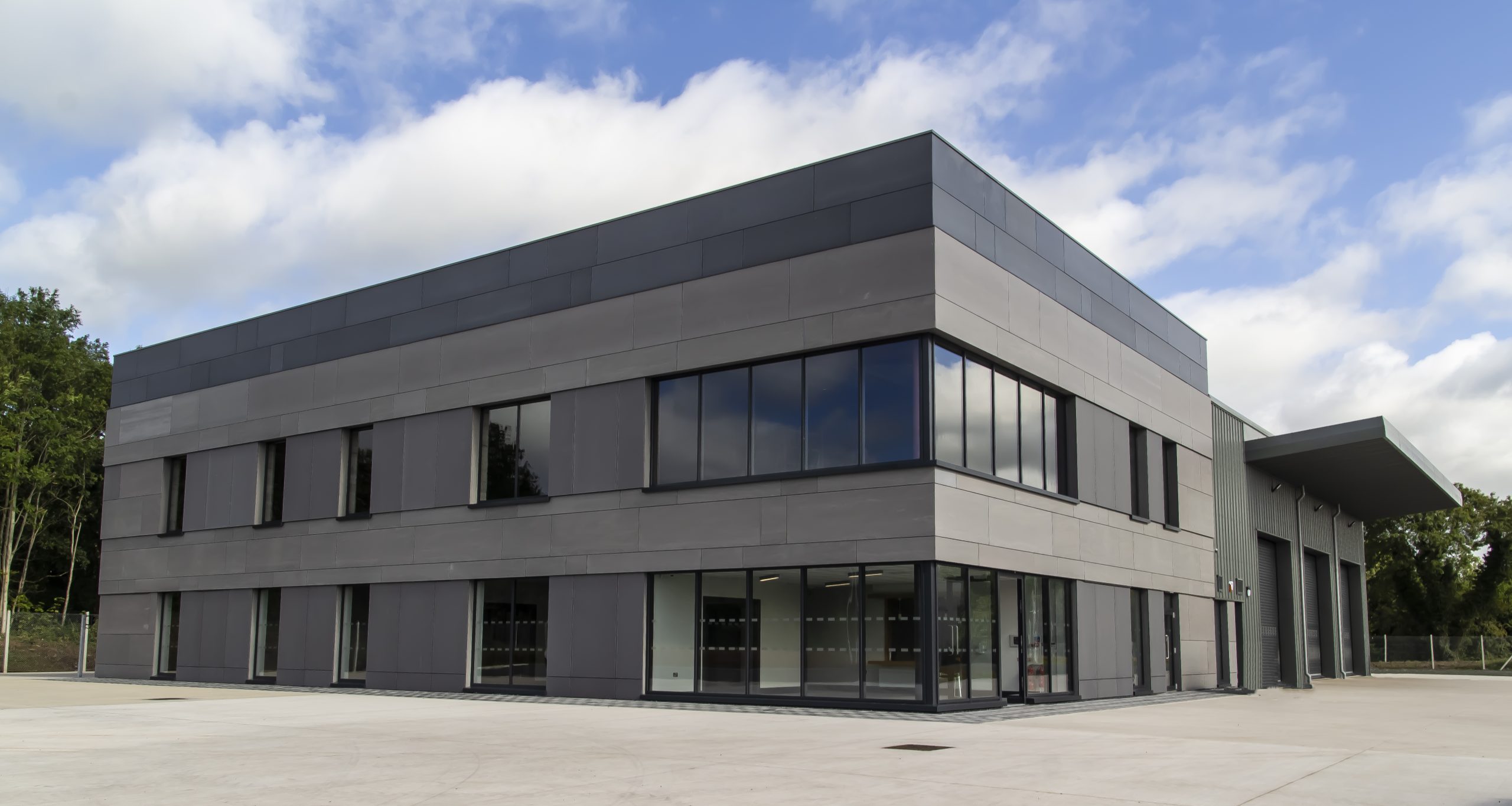
Externally, fibre cement panels of various sizes are configured & laid onto a structural steel grid to compose the main elevation.
These combine with aluminium windows and a grey tonal colour scheme aims to play with both the colour and textures of the materials to create an unusual & quite unique elevations style.
As we move towards the rear of the building and the more utilitarian processing areas, the materials change to that of insulated metal cladding panels which are more reflective of the nature of the internal use. This also enabled us to deliver the project within budget.
 SUSTAINABILITY, ENERGY CONSERVATION AND INNOVATION
The layout, form, details and relationship with site, heating system, sections of glazing, heat recovery systems, lighting systems all ensure that the building, like the company who own it, have at their heart an environmentally sustainable approach.
The materials used in the construction were all sourced locally, and the aggregate was from a recycled source. This helped keep the embodied energy levels of the building materials to a minimum. The use of internal stud partitions allows for flexibility and adaptability of the spaces & future proofs the building to ensure that any possible future changes can be accommodated easily.
Rainwater collection and harvesting, solar panels, geothermal energy all added to the overall environmental strategies and scheme design.
The use of southern glazing to capture solar gains and smaller openings to the northern aspects allowed us to maximise heat gains and minimise heat loss.
 SAFETY AND SECURITY
In terms of accessibility, egress, lighting and signage during a fire situation, this building leads the way in terms of compliance and consideration of the end users.
Colour differentials, types of doors, canteen layout and lighting configurations as well as the reception area all cater for those with disabilities or physical impairments.
The fire systems are all monitored with internal fire containment and control being used as the optimal safeguards. Integration of fire lobbies, sprinkler systems and egress points all set the bar and deliver fire safety as an integral component of the design.
Specialist equipment is used to monitor access to both the building and wider site 24 hours a day. This ensures no vandalism takes place & no unknow individuals can access the property.
Overall, the safety of staff & visitors is a key priority for the company, and it boasts a clear track record in terms of staff health & safety.

